
When embarking on the journey to create a new luxury fashion brand, the key is to develop a distinctive identity that resonates deeply with its target audience. At Gordess, we aimed to infuse the rich, vibrant energy of the Caribbean with the refined, sophisticated touch of English design, resulting in a brand that stands confidently among the world’s high-end luxury labels.
The Vision: Caribbean Meets English Sophistication
Gordess was born from a desire to merge two cultures—bringing together the warmth and colour of the Caribbean with the timeless elegance of English fashion. Our task was to encapsulate this unique blend into a logo, wordmark, and emblem that would not only define the brand but also stand as a symbol of luxury and style.
A Collaborative Creative Process
From the outset, the development of Gordess was a collaborative journey. The customer had a clear vision but was also open to exploring different design routes. Together, we embarked on a detailed creative process, experimenting with various iterations to find the perfect green hue that would symbolise the brand’s connection to nature and luxury. The customer’s involvement was crucial in refining these ideas and ensuring that the final design aligned with their aspirations.
Crafting the Logo and Emblem
The creation of the Gordess logo and emblem was an iterative process. We began with a series of initial concepts, each reflecting the brand’s fusion of cultural elements. It was important to me that the logo not only represented the unique identity of Gordess but also felt like it already belonged in the luxury marketplace—fitting seamlessly alongside other high-end fashion brands.
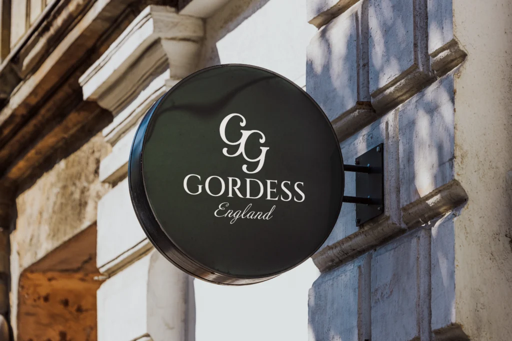
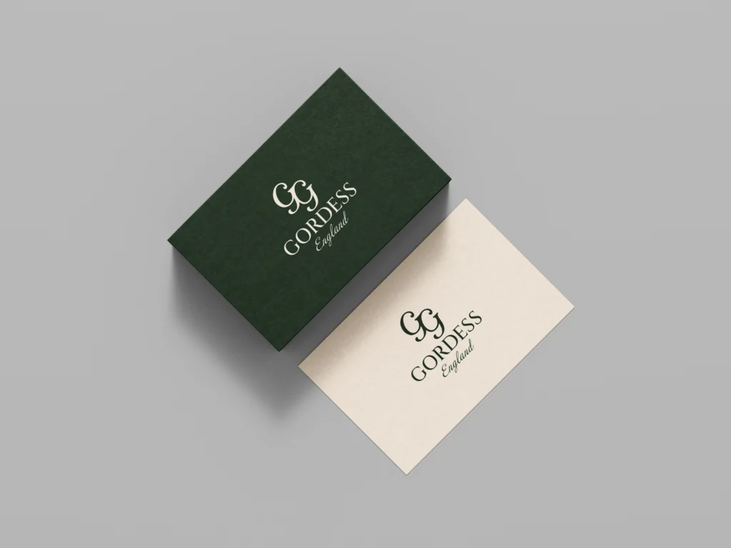
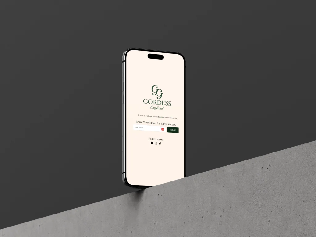
The customer’s input played a pivotal role in this phase, particularly in the development of the emblem—a pair of overlapping “2Gs,” which was inspired by a sketch they provided. This symbol now serves as a distinctive mark of Gordess, representing the unity of the brand’s dual heritage.
Typography and Colour Scheme
The typography for “Gordess England” was carefully selected to convey a high-end luxury feel, while also ensuring readability and elegance across all branding materials. We chose a font that balanced modernity with classic luxury, reinforcing Gordess’s position in the fashion industry.
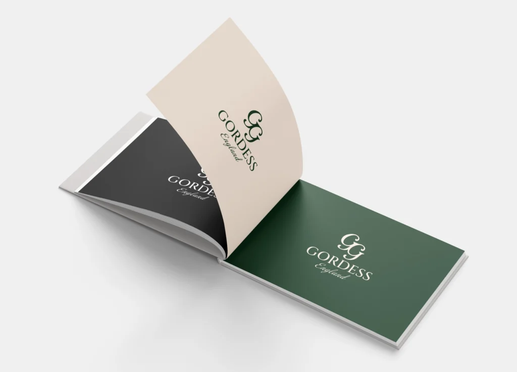
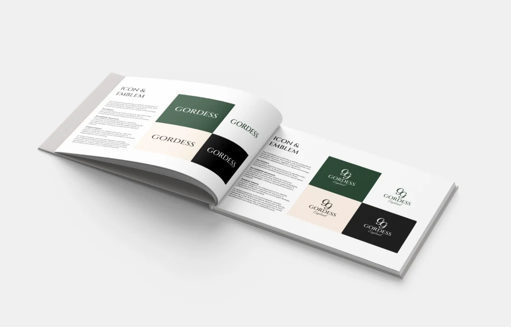
The colour scheme was equally significant. After deliberating on several shades, we settled on a palette that includes a specific shade of green complemented by creams and neutrals, echoing the natural beauty of the Caribbean while maintaining the understated elegance associated with English luxury brands.
Establishing a Consistent Brand Identity
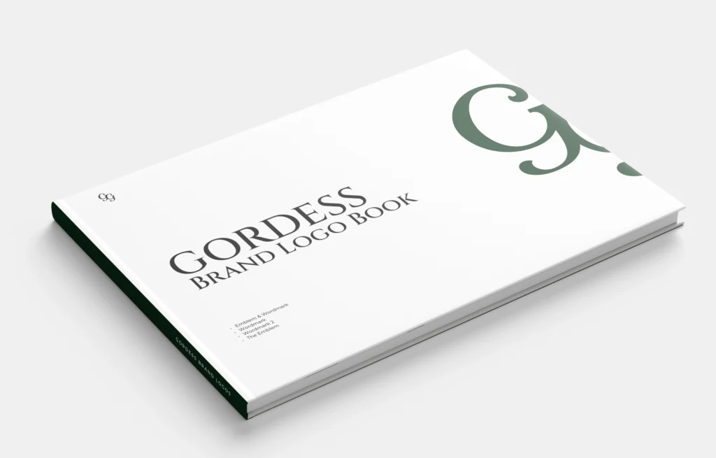
With the logo, emblem, and colour scheme in place, the next step was to create a brand book—a comprehensive guide to ensure consistency across all future branding efforts. This document lays out the principles that will guide the use of the brand’s visual elements in every aspect of Gordess’s identity, from social media campaigns to print materials.
The Path Forward
The foundation for Gordess has been meticulously crafted, ensuring that the brand can confidently move forward in establishing itself as a luxury fashion label. With the brand book as a guiding tool, Gordess is well-prepared to expand its presence, whether through an online store, marketing campaigns, or exclusive partnerships.
At its core, Gordess is more than just a brand—it’s a celebration of cultural fusion, luxury, and the art of fashion. We’re excited to see how Gordess will grow and thrive in the world of high-end fashion, staying true to its roots while continuously evolving.

Conclusion
The journey of creating the Gordess brand has been one of collaboration, creativity, and precision. By bringing together the vibrant spirit of the Caribbean and the classic elegance of England, we have established a brand identity that is both unique and timeless. As Gordess moves forward, its solid brand foundation will ensure its place in the world of luxury fashion, making it a name to watch in the years to come.